
Website Design: It’s Not About Pretty. It’s About Reading the Room.

Updated: Feb 19
Have you ever stood in front of one of those massive walls of paint chips at a home improvement store — the ones with 264 shades of green?

Somehow they all look the same. Somehow they all look completely different.
Choosing paint is not really about color.
It is about reading the room.
Thirty years ago, when we bought our house, it was beige on beige on beige. I remember standing in those rooms completely frozen. I didn't know where to start.
So I bought a book. An actual book. On interior design.
I got the most insight from the first two pages.
It said: decide what emotion you want to feel in the room. Then find things that make you feel that way. Put them together. The space will become cohesive because it is anchored in emotion, not just color.
That lesson never left me. I have approached every space I design since then — physical or digital— in the same way.
Years later, when my youngest daughter wanted to repaint her room, she stood in front of all those greens and blues and said, “I don’t know if I want green or blue. All I know is I don’t want gray.”
She picked up a swatch titled When Green Meets Blue.
“Yep,” she said. “That’s the one.” One and done!
On the other hand...my oldest daughter has seven shades of beige painted on her basement wall because she cannot decide which beige is right.
Two approaches.
One anchored in feeling. One anchored in comparison.
Impulsivity, just like analysis paralysis, can lead you to make the wrong choice — or not choose at all.
My approach? Websites are rooms too. You can go with your gut, never commit, or back up and zoom out to make a smart choice.
About The Code and the Cloud
Websites are built on 1’s and 0’s. Efficient. Precise. Cold.
When someone lands on your site, they are not walking through a cozy storefront or lobby that you carefully curated. They are staring at a screen. They are connecting with the cloud — efficient, invisible, and cold.
Design is the bridge. The colors, the imagery, even the fonts chosen create an atmosphere that reflects your branding and your message.
These things don't magically make something human. But it can reflect the humanity we are longing for on the other side of that screen.
Let's Dial It In
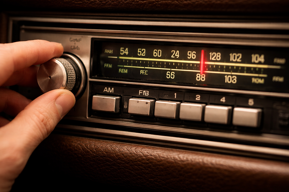
Color is not a switch. It's a dial — an emotional dial. Remember those old radio dials, before everything was digital? I am old enough to remember when you had to turn the knob carefully until the signal came in clear. If you were even a millimeter too far to the left or the right, all you heard was static.
The station was there. The signal could come in. But the static made it painful and frustrating. Designing a website works the same way.
When a site visitor is looking for peace and calm and they are hit with loud colors and screaming headlines — STATIC. When someone hits your site looking for strength and confidence and what they see is soft pastels and endless paragraphs — STATIC.
We have the knowledge to cut through the noise.
For years environmental psychologists have studied the phenomenon around color theory. Research has shown that certain colors, like red, elevate stimulation and intensity, while others, like blue, are more often associated with calm and creativity (Mehta & Zhu, Science, 2009).
That doesn't make one color better than the other. It simply means color communicates a feeling and emotional response before words ever do.
Dialing it in removes the noise. It removes the friction. It removes the confusion.
Atmosphere Matters
Would you paint your bedroom the same color you would paint a child’s playroom?
Both rooms matter. Both can be beautiful. But they serve different purposes.
Websites are no different.
A website should be created as an intentional space with the intentional purpose in mind. Color is not decoration. It's atmosphere. It's tone. It's signal.
At CWS, every aesthetic decision is made with intention, because excellent design is never accidental.
We can reach the goal of excellent design when we focus on the emotion that matches the experience your business offers.
Remember...choosing color is not about what your eyes see.
It is about what your heart feels.
Let’s Read Your Room Together.
Great design is never accidental.
It is thoughtful, intentional, and built to support growth.
If your website feels “off” and you can’t quite explain why.
it’s probably not the code. It’s the dial.
Let’s tune it.


Comments